First In-House Designer at AOL
1994 to 1996
UX Design, UI Design, Illustration
The Role
In 1994, AOL was a distant third-place online service behind CompuServe and Prodigy. Virtually nobody had access to the Internet outside of these services, or even knew what it was. The concept of "being online" was novel. Things like email, the World Wide Web, "downloading" anything, or connecting in any way other than the telephone were known only to a very few.
I had been online. In fact, I was a member of AOL (and QuantumLink before it). I had just graduated from Art School, not sure of what I wanted to do for an actual pay check, and saw an ad in the Washington Post for a "graphic artist" under the AOL logo. I knew I had absolutely no chance at this job, but I gave it a shot. For reasons that remain unclear to me decades later, they hired me as their first in-house designer. My role would be to create or manage every pixel of every image that went online.
Results
AOL is an afterthought now, but when I left in 1996, AOL defined the online experience for almost everyone who went online at all. And it would continue to do so for years to come.
The User Experience
Terms like "User Experience" didn't exist at the time. There were no books to buy about it (or even screen design in general). And, of course, if you wanted to buy a book, there was no Amazon. You went to a bookstore.
This is relevant because we were designing something for a massive audience that have absolutely no frame of reference for what we were offering. There was no familiar vocabulary. Even simple terms like "sign on", "welcome screen", and "home" were hotly debated. Was it "home" or "top" or "start"? The terms people were (barely) familiar with in the computer world frequently did not apply to the online world. And we did not want a cold computer interface. We wanted a warm, friendly human interface.
We learned to test on the fly, informally with no idea what we were doing. But we knew that we knew nothing, and getting any feedback was like gold. New hires were frequent test subjects. I would spend time just sitting behind them, watching them fumble through their first exposure to the online world. Literally, people would come to work for America Online never having been online, never having heard the screech of the modem connecting. But that was because almost no one had.
Innovation
By necessity, AOL had a culture of innovation. Almost everything we did was being done for the first time. It's hard to know the trails we blazed or the standards we helped set (for the good and not-so-good) that might persist today in the digital world. To look back on the work now makes it seem laughable in how amateurish and dated it all is. But we had very few guides. In fact, I wrote the AOL Art Guidelines, the documentation our partners—companies like NBC, ABC, NFL, Viacom, etc.— would use to design their "areas" on AOL. I got to work one on one with all of their designers, top-notch professionals who had no prior reason to know what a pixel was.
I must have explained anti-aliasing ten thousand times.
Sign On Sequence
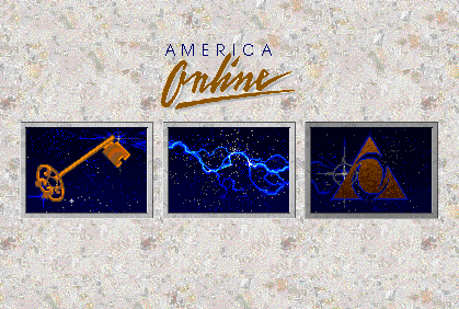
One night I was working late, finishing up the 2.0 release of the AOL software and it occurred to me that nobody had redesigned the sign-on sequence. At that time, in consisted of a technical drawing of a pair of connectors and a house key. I asked if there was time to do some new images. The dev team said that if I could get them images that night, they'd order some pizzas and include them into the build.
Nobody but me, my manager, and a handful of devs knew these images were going to be changed, and my manager never saw the finished work until it was online. It became iconic. Even decades later, it remains a work that a few old salts from my generation recognize and remember with fondness.
Leadership
Our design team grew quickly. I worked alone for the first year or so, but by 1996, we'd grown to a team of 6 designers - they called us graphic artists - and 2 to 4 production artists. I had the fortune to lead this team in its growth, and it remains one of my proudest accomplishments. Much of the work below is theirs, but it's here as a representation of what we were doing as a team.
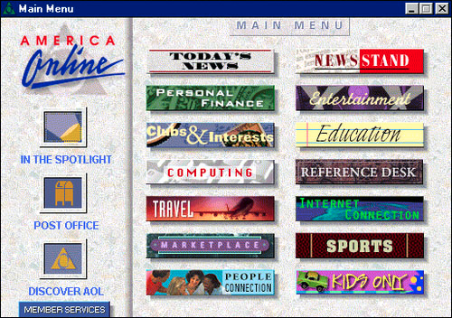
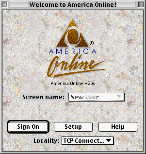
By the way, if these screens look small, it's because they are. In those days, we designed for 640 x 480 pixel screens. an 800 x 600 screen was the highest of high-end. Not only that, but the Mac color palette allowed us 255 colors (leaving one for transparency). That was great, though, because the Windows palette only allowed us 16.