Contract UX Design for the FedEx Hong Kong web site
July 2017 to September 2017
UX Design, Content
The Project
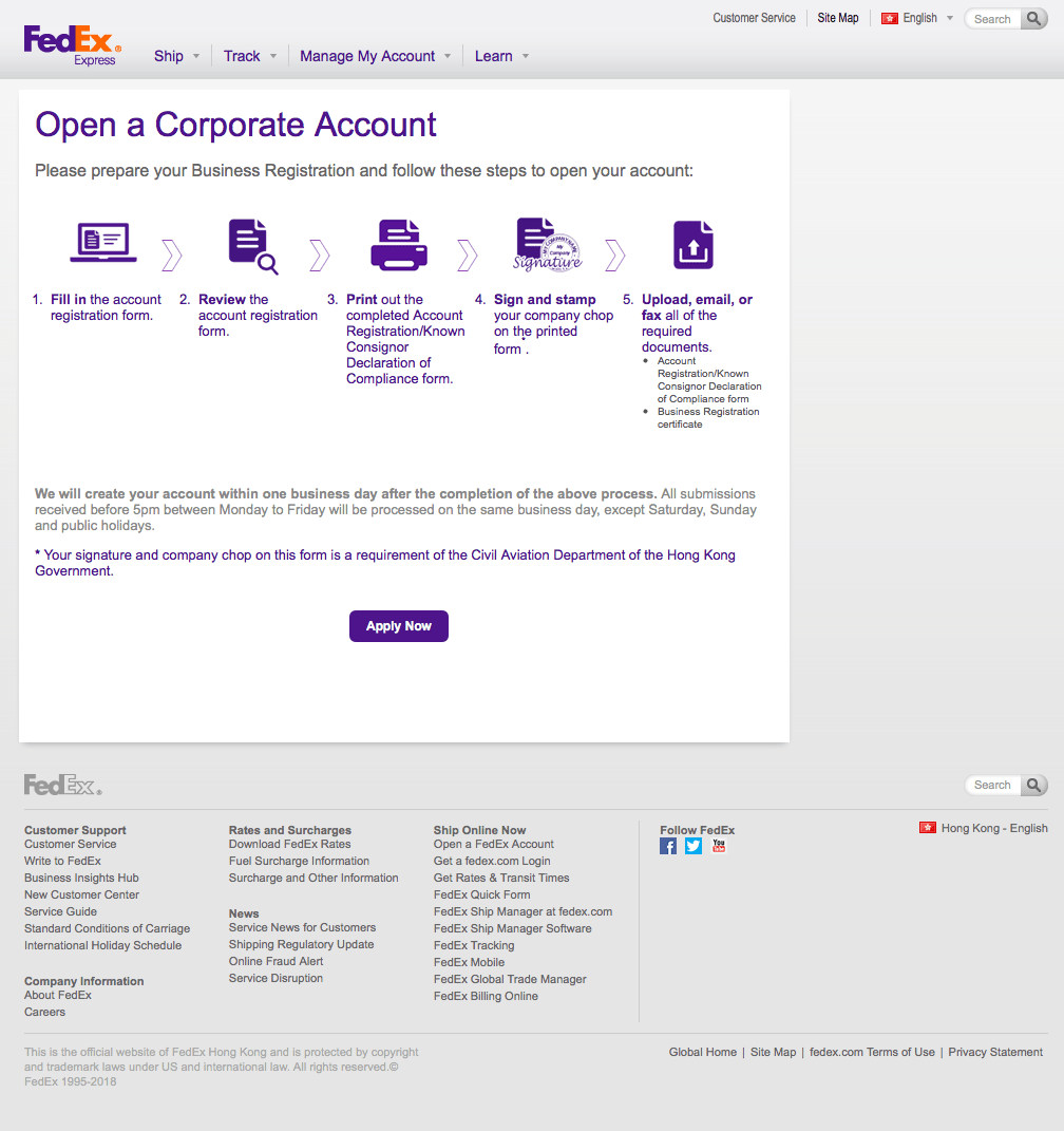
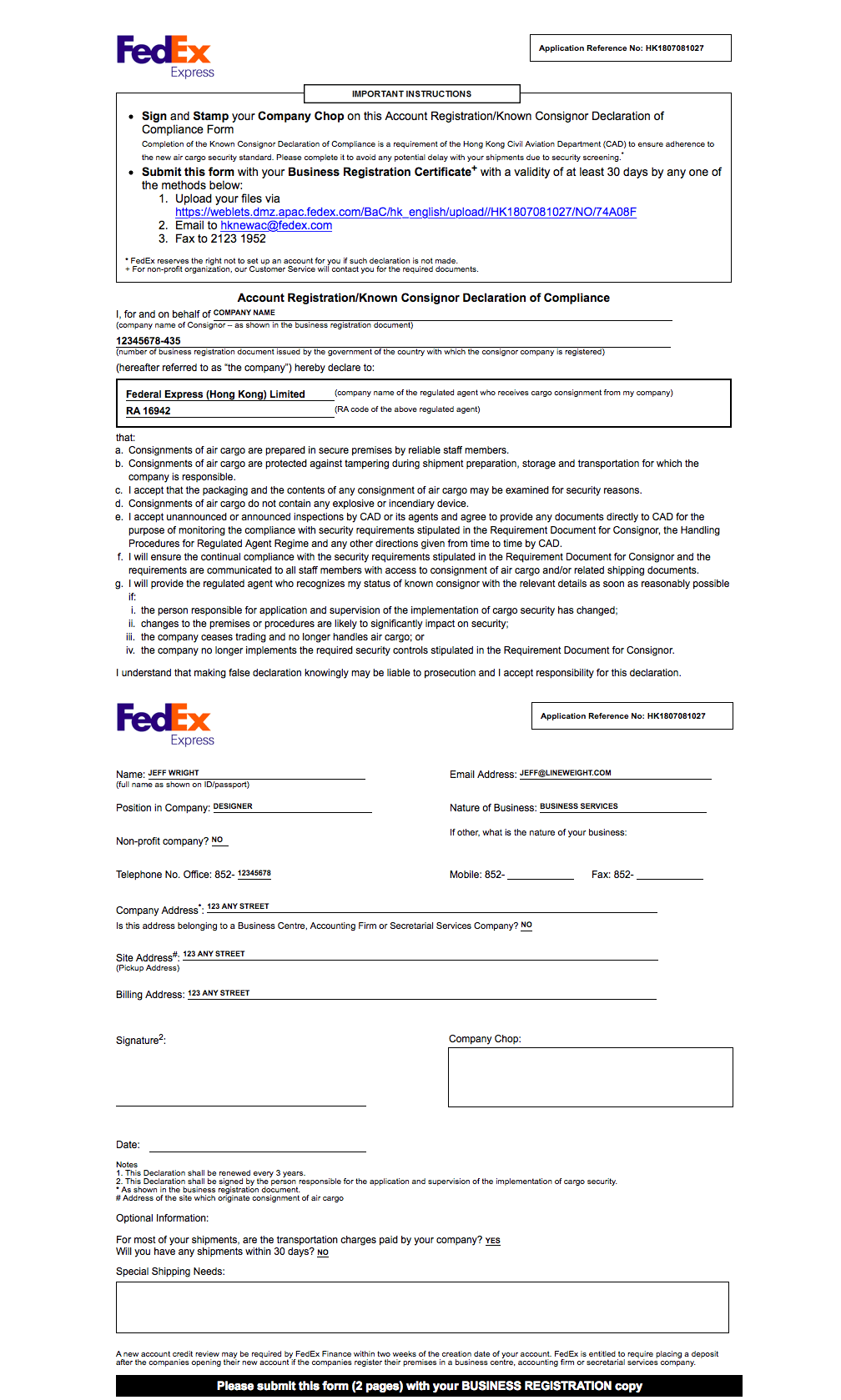
According to Chinese law, FedEx Hong Kong needed to require anyone opening a new account without a credit card to provide a formal document that included their company "chop"—a physical stamp, in ink, on paper. They needed someone to dig into the requirements, find a way to make that as intuitive as possible in a digital experience, and innovate how those solutions could be implemented with very little available bandwidth on the back-end.
I lead the project on behalf of a team of three partner companies, working together on a solution.
Results
FedEx Hong Kong launched the first-of-its-kind feature to its customers in 2017, allowing Chinese citizens without a credit card to open an account.
The User Experience
The UX was heavily influenced by two non-human factors: 1) the requirements of Chinese law, and 2) the rigid and well-established patterns of the sprawling FedEx web site.
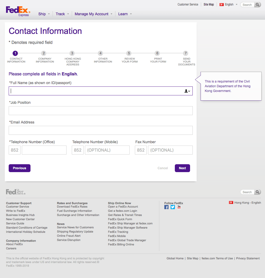
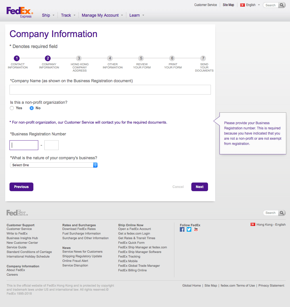
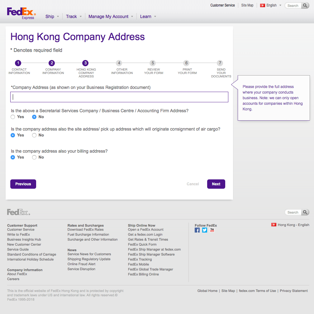
In addition, we were guided by the paper form on which a customer, a Chinese citizen, would apply their "chop". It was a dense and difficult document that we were not permitted to update, creating a number of difficult design constraints. We needed to match the questions asked, in their specific order, with specific accompanying text as closely as possible. And, of course, the design needed to work in English or Mandarin Chinese—with very little predictability on the equivalent length of any translated phrase.
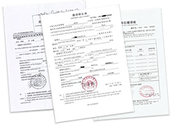
A Digital Workflow for a Physical Stamp
We started our process by brainstorming innovative workflows through which a user might deliver a physical stamp with the technology available.
Fax was acceptable, which meant that other forms of electronic delivery might also work, so long as the final product could be printed. Among other options, we investigated scans (of forms and chops), a photo of the document, some form of digital chop, API connections with public databases, and many others.
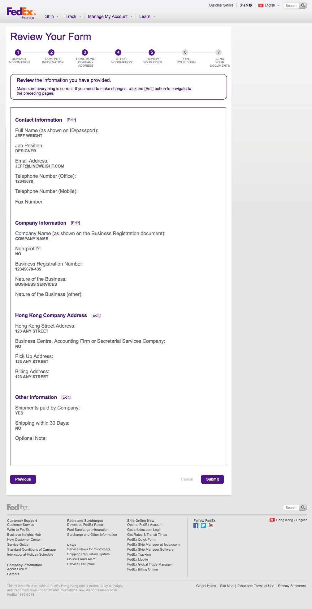
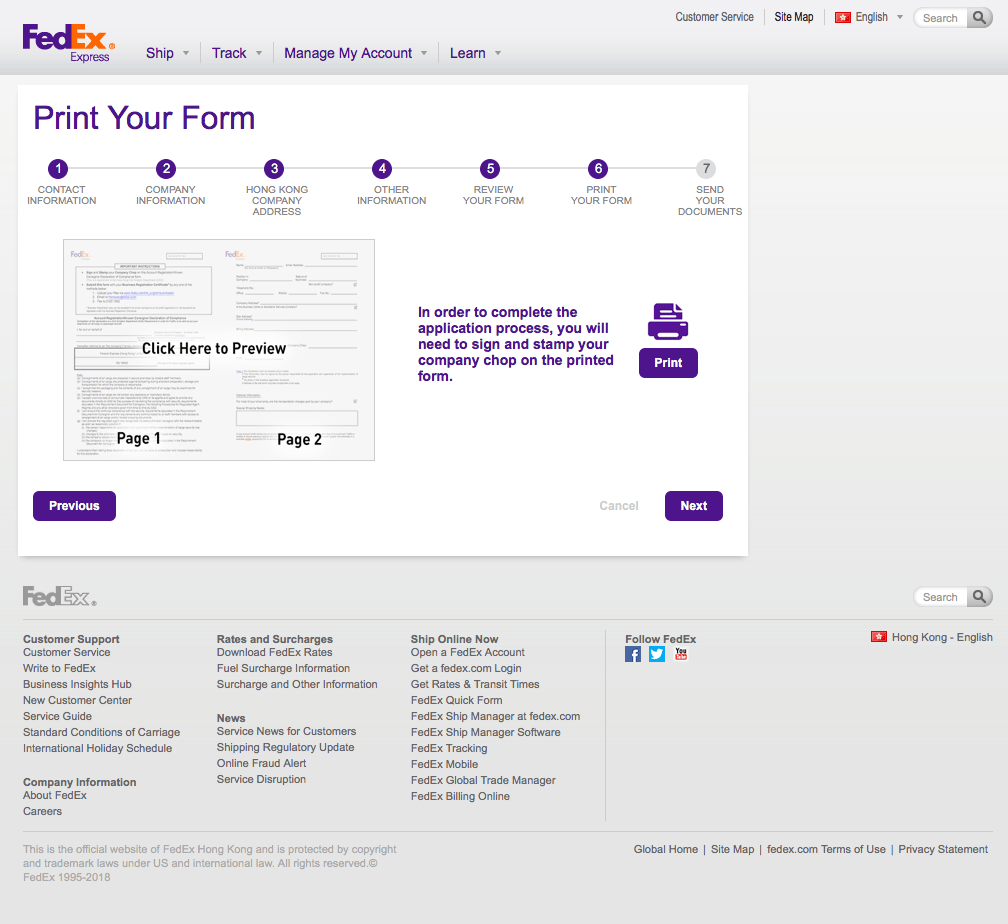
We settled on a flow that allowed the user to produce a completed PDF form, print it, stamp it, and send it back via scan or fax. Future iterations might take the product into more innovative directions.
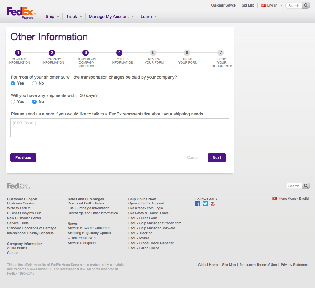
Since we knew we needed to adhere to the FedEx visual style, and since that style was very straightforward and simple, we began incorporating actual UI elements at a very early stage. This allowed the client to more easily and accurately gather feedback in China. For this project, we had to rely on our clients to be our connections to the customer. We had no ability to do that from the U.S.
The User Interface
FedEx provides rigid branding and UI guidelines, many of which do not supply breathing room for new elements. I designed an interface to their specifications, with only minor departures where necessary or as requested by the client. We delivered multiple rounds of revisions, finding common ground between conflicting feedback from multiple stakeholders and inconsistent user feedback.
Throughout the design, we preserved space for in-context messaging that would only appear if and when the user needed it, with ample allowances for the difference in text length between english and Chinese. Similarly, form elements would only appear if needed, based on previous inputs, and the messaging of each field would fit the user's specific context.
