Co-Founder, VP of User Experience and Product, Sqord
April 2016 to April 2017
Product Ownership, UX Design, UI Design, User Testing, Illustration
The Role
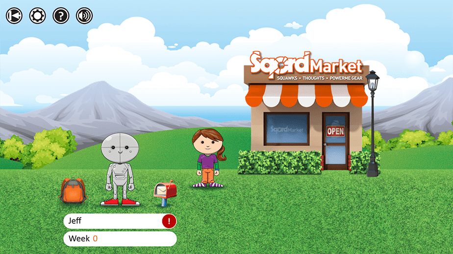
Sqord is a software/hardware platform seeking to make healthy, active play more fun for kids. Our goal was to create a digital social/game experience for kids that would encourage them to get more physical activity. We had proven our process on the web, but now our goal was to translate that to a mobile experience and take it to the next level.
Results
The mobile app was wildly successful. The number of daily active users on the platform tripled within one month, and the number of parents engaged with the platform quadrupled. Support cases dropped to one-fifth their prior volume through the launch and each subsequent feature release.
The User Experience
Our ideal session consisted of a user signing in, syncing their activity data, interacting with their peers, receiving their awards, and leaving to go get more physical activity. Sqord relied on user interaction to create updated content for other users. When kids engaged, they created social content and updated competition goals for their peers.
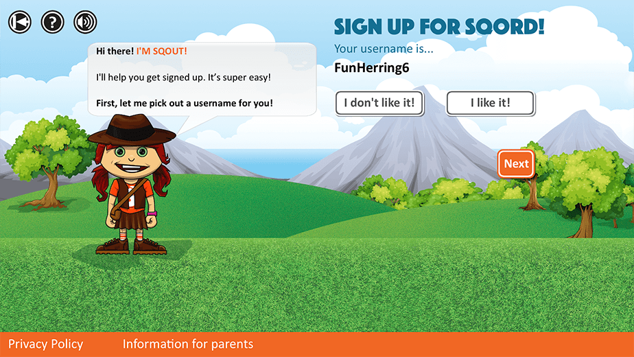
Since our users were children, we created a system of communications using only canned messaging. This prevented bullying, made communications quick (no keyboard necessary), and also allowed us to turn messages into rewards. If you wanted to be able to say a certain phrase, you had to earn it.
This approach served engagement well. It allowed for short, but productive sessions; lots of motivation from session to session - both in the desire to earn messages and receive messages; and a very visual UI rather than one based on text.
From a production perspective, each individual function was mapped in simple flow diagrams, with error states and edge cases. This let us move users confidently through game cycles and gracefully include or remove feature elements from the flow. Each feature element was designed to be independent of other feature elements. It could be present or not. This let us consider each feature element as a potential reward to be earned, made it easy to design and develop additions, and made it painless to sunset elements that were not working.

Deliberately Limiting Engagement
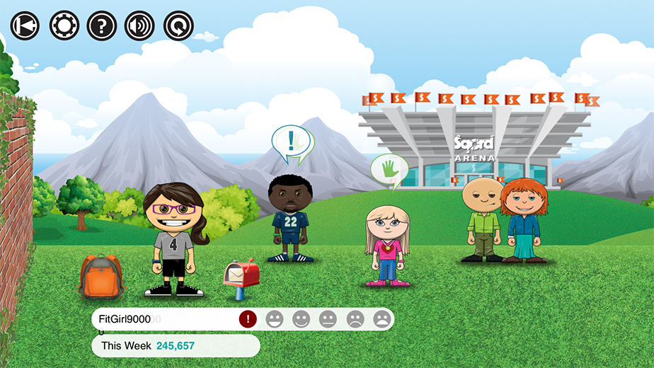
Unlike virtually every app ever designed, we were concerned about kids spending too much time with it. The goal was to get the players outside, playing in the real world. We did not want kids ending up with more screen time because of our app. So we designed workflows and game cycles that were short, with deliberate points of disengagement - now go play! - but that repeated daily and weekly.
A single session should last only a few minutes, but a lot might change in a day, so the motivation to come back was strong.
This philosophy led to a lot of very interesting conversations with investors and other stakeholders, who were used to session length being a key performance indicator. For us, it was ten minutes, tops. Seven was ideal. Eleven was too much.

A Hands-Free User Experience for Crowds
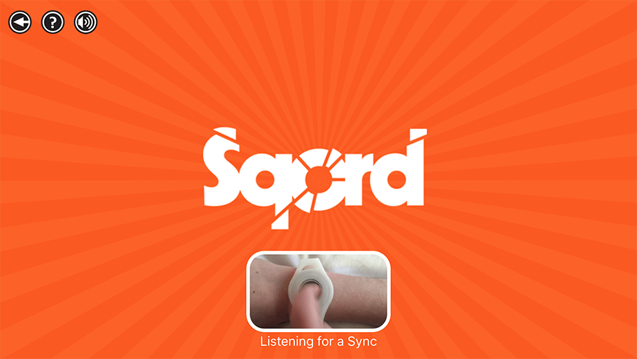
One important and unusual use case for the Sqord mobile app was to allow crowds of kids between classes, during P.E., or at events to sync their Sqord devices without any need to physically touch the device. The device might be behind glass, or it might be the phone of another student or teacher, etc. So if the user needed to touch it, we'd be dramatically limiting the opportunities for players to sync.
Working with the extended team, we designed a workflow that allowed any (reasonable) number of kids to sync their devices simultaneously, and to see their individual results in a running queue. This required close collaboration with the hardware manufacturers, firmware developers, and significant contextual testing.
The UI
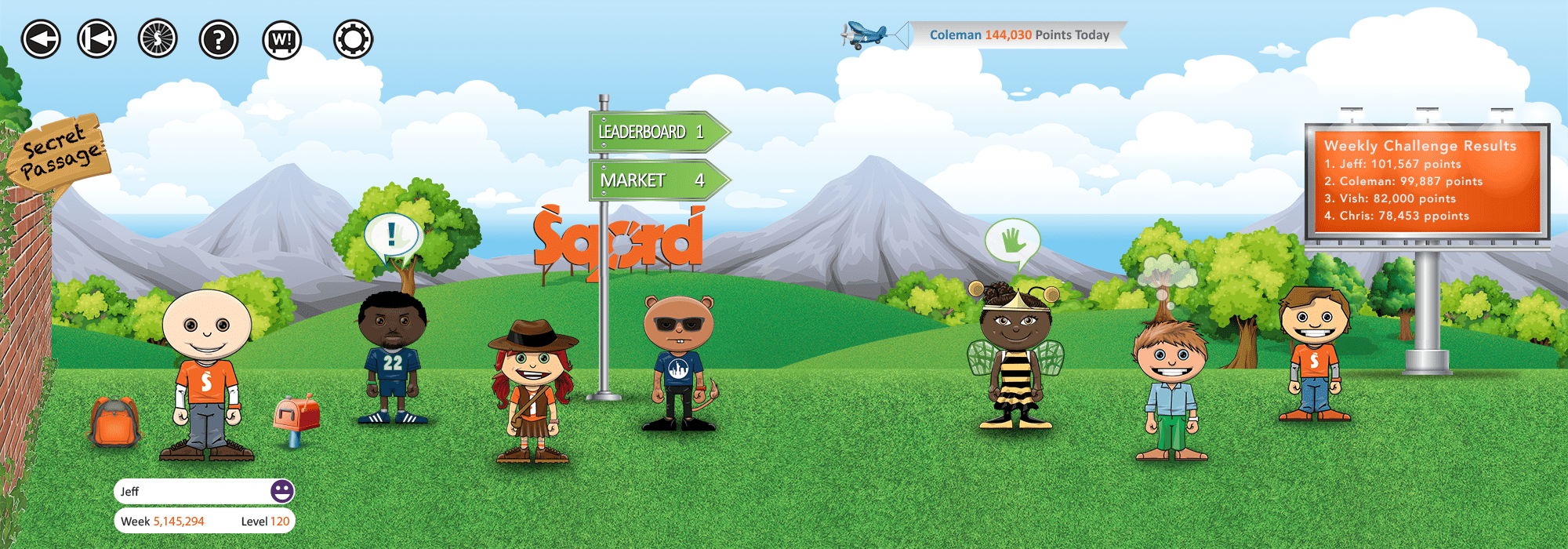
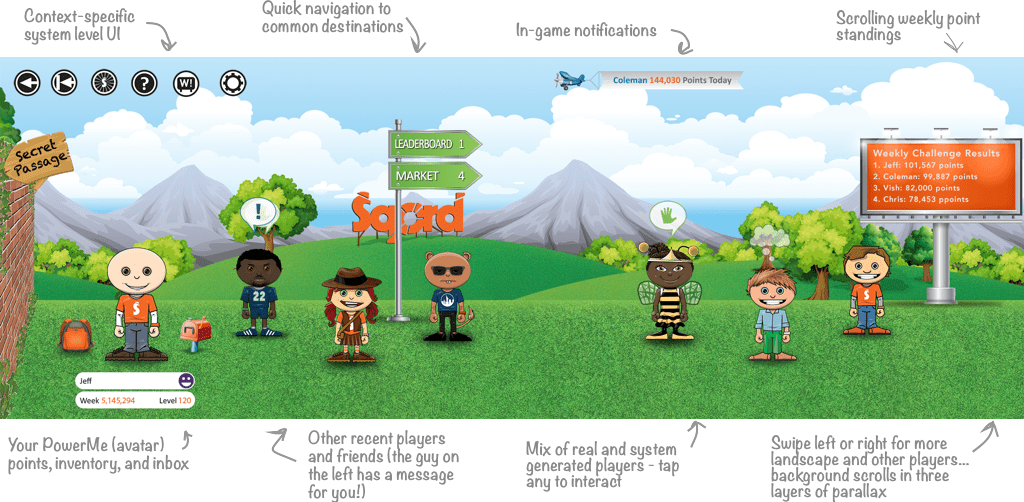
The Sqord app needed to look and feel like a game, though it was really a fairly simple social app and data tracker. But that rich visual experience had to be created with limited production capabilities in mind. We didn't have the cycles to create game visuals as fast as we needed to deploy updates.
We worked with kids, and designed a UI that felt expansive, engaging, energetic, and intuitive to them—while finding innovative solutions to the constraints of our development resources and available technology. And for each element where a sacrifice was made, or where we were experimenting or taking on some engagement risk, we worked to assure future flexibility to make improvements. Nothing was set in stone.
Usability Testing & Iteration
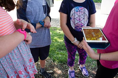
We tested the app constantly. We had formal testing throughout the design and development process, starting with early prototypes and continuing after deployment. In order to get clear feedback, we tested with kids and parents, both in controlled settings and in outdoor full-on play. We did our own extensive testing in-house and also contracted an outside company to independently test some elements, where we needed depth, validation, and/or a check against our own biases.
Our methods included numerous one-on-one sessions with kids and parents, focus groups with kids at play and at school (some of the most fun I've ever had in a UX role), contextual studies for numerous use cases (and a lot of unstructured play), screener surveys to targeted groups, and more.

Player Avatars
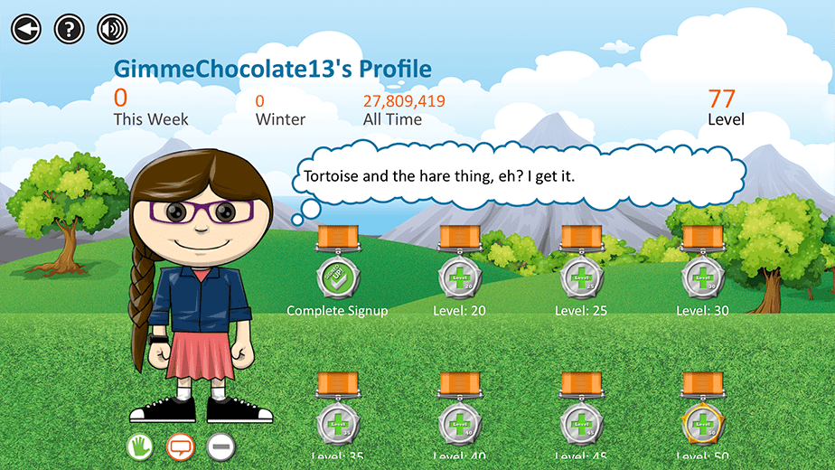
Sqord users created a personal avatar (called a PowerMe) from a selection of hundreds of items, which they bought with in-game currency. In order to facilitate this on the mobile platform, I designed a simple, innovative system in which scalable SVG images were layered to create the avatar. We identified shapes within the SVG files which could be re-colored by the user, and the system wrote new color information dynamically. This allowed us to have one set of avatar image files, shared by every user, allowing any color, and any size, and in any combination. As different combinations were needed, the back-end generated a .PNG file which was easily displayed by the mobile device, requiring very little bandwidth and memory.
The Sqord Cast of Characters
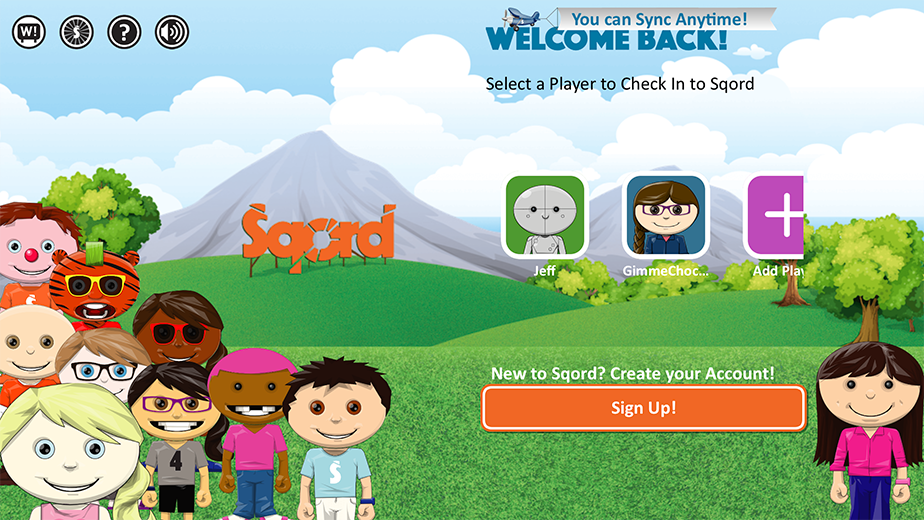
A Handful of Actual User-Created Sqord Avatars
All of these player avatars were created from nothing more than a blank body and the player's selection of clothes, facial features, etc. layered in a very controlled order, and shown in the base color of their choice.
